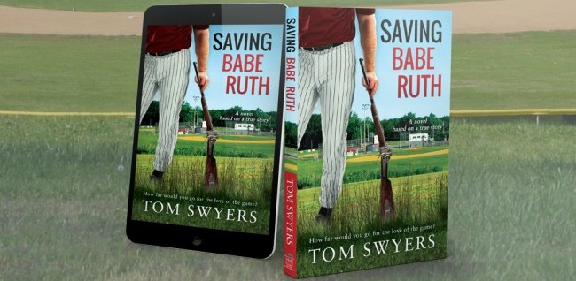
Yes, the cover for Saving Babe Ruth has finally been revealed. There’s a story of romance and passion behind creating the cover. Oh, my, is it me or is it unseasonably warm around here?
(Author’s Note: Rebecca Thatcher is a fictional character created for the purpose of this article. She doesn’t exist. Really. I’m not kidding).
They say you can’t judge a book by its cover. I suppose that’s true. There are a number of baseball book covers that are lacking, but the books themselves are well written and well received. The Art of Fielding is one that comes to mind for me. The cover doesn’t suggest the book has much to do about baseball at all, but maybe that’s the intent of it. Maybe the publishing house wants to make a book more widely marketable to readers whose main interest is not necessarily baseball.  I had a multitude of offers for Saving Babe Ruth from a great number of publishers, at least in my own mind. In the end, I chose the newly created Hillcrest House Publishing as my publishing house. The firm is headed by Rebecca Thatcher—an intelligent, dynamic and gorgeous young woman.
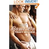
Trust me, there is nothing going on between Rebecca and I except a healthy love-hate relationship. We argued for months over my book cover. She wanted to go with the artistic flair of a an Art of Fielding cover. I told her that I love art as much as anyone else. I said there’s plenty of art in my genetic make-up. I informed her that my family is found posing in a number of Norman Rockwell’s illustrations. In fact, my great uncle did illustrations for the Saturday Evening Post. My uncle drew cartoons for Playboy and The New Yorker. My sister is an artist. There’s even some art in Saving Babe Ruth.But I had to put a halt to art with the cover. I told Rebecca I couldn’t risk going with an artsy cover mainly because I am an unknown author who couldn’t risk being undiscovered behind an enigmatic cover, especially given the competition in one of my possible ebook genres: sports fiction and literature. Sure, The Art of Fielding is also in that category, but the genre is inhabited mainly by book cover stud muffins. Rebecca didn’t believe me until I e-mailed her these covers one day. 


She looked at them and later requested that we meet one steamy night last August. I found it a bit strange that she wanted to meet on some old, long forgotten baseball field. But she’s a respected publisher. And so I did what any wannabe author would do: I did what I was told.
It was dark at the baseball field parking lot, except for the moonlight and the cascade of stars throbbing through breaks in the soft, puffy clouds. Her black Volkswagen Beetle Convertible Turbo was parked in the lot with the top down revealing the red leather seats. I saw a light in the dugout and figured she must be there. I walked over and looked down into it. There was a flashlight sitting on the bench which shined on her long, crossed legs. I couldn’t see her face. She wore a black miniskirt, black stockings and high heels; her top leg bounced up and down in anticipation.
“Sit down beside me,” she said as she gently patted the bench by the light with her tanned hand. Her nails were long and painted magenta.
“Sure,” I said as I slid down beside her. What man would say no?
She took the pictures out of a folder with one hand as she held the long tube flashlight in the other. The pictures trembled under the light while she held them.
“I know why you sent me these photos,” she whispered.
“Good,” I said. “There’s no need to talk then.”
“The photos say it all,” she said as she fiddled with the flashlight in her hand.
“So no artsy cover then, agreed?” I asked.
“I’ll let you have your way with the cover,” she said softly, “if you have your way with me.”
At least, that’s what I thought she said. “Hold that thought,” I said as I felt a movement in my slacks and adjusted myself. It was my cell phone going off on vibrator mode. “I probably should to take this call.” Cher, my wife, was blinking on the caller ID.
Rebecca laughed.
“Hello?” I said speaking into the phone. Cher, my wife, greeted me in an upbeat mood. She asked if I would buy some cream for her on the way home. She needed some for something she was baking. She didn’t know where I was and she didn’t ask any questions. I could tell by the look on Rebecca’s face that she had overheard our conversation. “Sure, Cher,” I said.
“You’re the best. Love you,” she said before hanging up.
Rebecca got up. I could see her face partly lit by the flashlight as she stood. She was perspiring a little on her forehead, her lips were moist. But she had that business look on her face. I had seen it before. I knew whatever we had between us a few moments ago had faded with the coming and going of Cher’s phone call.
“You can have your way with the cover,” she said. “You make a very good point.” I stood up beside here and put my tee shirt back on.
Oh, I forgot to mention that I had taken it off while talking with Cher on the phone. It was all part of my plan. Rebecca had seen during the phone call that I wasn’t packing a six pack of abs. At most it was two, and you had to look real close, perhaps use a little imagination as well. I was in pretty good shape, I thought, but I knew I was no stud. Rebecca had seen it too. I was in midlife and she was half my age.
A few days later, she sent me this cover idea in rough form. She liked the concept though she wanted the sky darker, maybe pitch black.
 I kind of liked it, at first. But something didn’t set quite right with me. I couldn’t put my finger on it. Then I discovered that many women friends of mine loved this cover. Male friends were okay with it, but were far less enthusiastic. It occurred to me at some point that the cover was off balance–there was too much text on the bottom half. Then it hit me. The cover was highlighting the male model’s crotch. Rebecca had taken it too far. She had thrown in some not so subtle beefcake.
I called her up. “This guy’s junk is staring me in the face,” I said.
“Yeah, isn’t it great?” “But it’s not that kind of book,” I said.
“Sex sells,” she replied. “Readers expect that in this genre. Give them what they want.”
“Yeah, well I’m not selling out,” I insisted.
“Well, how about something more abstract then,” she said. “You know, something artistic.” She was playing that artsy tune again. I could hear the sarcasm in her voice. She was toying with me now.
“The book is about one man defending baseball,” I said. “So the overall cover idea you have is sound. The model looks like he’s guarding the field. ”
“I wanted to highlight the sexual relationship between Annie and David,” she chimed in. “Their relationship speaks for itself in the book,” I replied. “It’s a lot more subtle. This guy’s junk hanging out is going to mislead readers. Besides, do you think some guy is going to read this book in public?”
“You need to appeal to women. They mainly buy books in this genre.” I knew I was up against an entrenched view in the industry. “Stop insulting women readers. And don’t forget that men read books too. Maybe the publishing industry needs to try and meet their needs. This book is for both men and women who love baseball and all it means for kids.”
We argued along these lines for days. During this time, she kept mentioning Calico Joe, John Grisham’s baseball novel. She then sent another cover idea alongside of the cover from Calico Joe:


John Girsham’s Calico Joe has at least three different covers. This one by far the darkest of the three and the one currently being used for the ebook version.
I called Rebecca up. “You know, the title to the book is Saving Babe Ruth, not Saving ‘Baby’ Ruth.”
“This title is sexier,” she said.
“Baby Ruth is a candy bar,” I insisted. “What’s with all the darkness anyway?”
“Darkness sells.”
“Saving Babe Ruth deals with some darkness,” I said, “but it’s not a dark novel like Calico Joe. There’s humor. It’s fun at times. I’d like to think it’s uplifting too. It conveys a number of positive message to anyone who will listen.”
“Darkness sells,” she said with an edge.
“There’s too much darkness in film and books today,” I insisted. “I’m tired of it and I think other people are too. They’re sick and tired of being fed the same dark crap.”
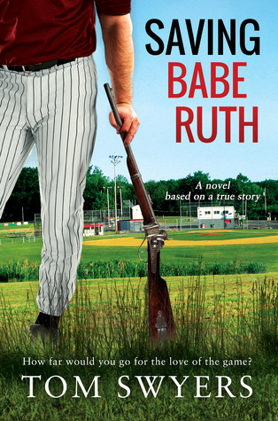
The book cover story has a happy ending. I told Rebecca that I was taking over the design. I hired Derek Murphy who has been working with me ever since. He’s been great. After a number of versions, we came up with the final design as seenbelow. Even Rebecca likes it, though she would like the guy to be shirtless and show some musculature. Not going to happen, Rebecca. No beefcake for you. Not today.
You can read more about Saving Babe Ruth here.  [wps_custom_form id=0]

