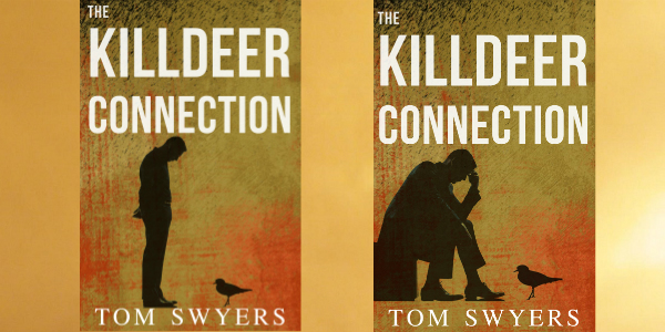
 Developing a cover for The Killdeer Connection was no easy task.
I thought it might be interesting for readers and writers to see the process at work before I officially reveal the WINNING cover for the upcoming novel in a little over a week.
What I’m doing in this series of articles is to analyze some book covers and tell you what I liked about them and why I ultimately rejected them.
In the first part of this series, you can see how I wrestled with having a killdeer on the cover. Click this link here to read that article. In the second article, I toyed with the idea of having an oil pumpjack on the cover as opposed to a bird. Click this link here to read that article. In the third part of this series, I tried to apply some findings from Netflix ads to book covers. That didn’t work out so well. You can read that article here.
As stated at the outset of this series, the overall goal for any book cover is to sell books. Along the way, I came up with two criteria to meet that goal:
(1) It has to mix in with other covers in the genre but it has to stand out at the same time.
(2) The cover has to convey the real story in a compelling way that connects with the reader.
So with that in mind, let’s look at my fourth attempt to create a cover.
Since the winner of my book cover contest in my third article was a silhouette of a man looking down on a bird with a very eerie backdrop (the first cover pictured here), I wanted to keep that theme but try something different. I thought that cover was lacking the thriller element. The first cover pictured here has a man standing and looking down on a bird out of curiosity. There was no tension. So I decided to add a cover with a man sitting down with his hand on his forehead. Maybe he is in deep thought, maybe he is troubled. I thought this cover conveyed more tension than the cover with the man standing.
I turned out to be right but wrong at the same time. In a poll conducted in a facebook author group, the cover with the man sitting won by a large margin: 73% to 27%. Not only was the first cover perceived as a man who was curious, some people thought the scene looked humourous. That wasn’t an emotion I wanted to convey through the cover.
Even though the second cover won this round, some people polled stated that this cover lacked anything that suggested the book was a legal thriller. I swung and I missed on that count. Though I’d like to think the book would appeal to readers other than fans of legal thrillers, I don’t want to abandon my base of legal thriller readers. Moreover, I thought I could do a better job of tying the relationship between the man and the killdeer bird on the cover to what happens in the novel.
In a little over a week, I will release the WINNING cover and also tell you how you can get a copy of the book for FREE. Stay tuned!
Tom Swyers is an attorney, judge, and the award-winning author of Saving Babe Ruth, the prequel to the David Thomson Lawyer Series. His upcoming legal thriller, The Killdeer Connection, is the first book in the David Thompson Lawyer Series. It’s about a lawyer who must battle the fracking industry before it kills him and his family. Sign up to join the readers group to keep up to date by clicking this link here .

